On the modern home design stage, color is undoubtedly the leading trendsetter. It acts as a magical paintbrush, creating a variety of colorful scenes in our living spaces. From soft warmth to cool modernity, from vibrant energy to tranquil stability, color matching not only reflects the unique taste of the occupant but also influences the entire home’s atmosphere and emotion.
1. Basic Color Knowledge: Unveiling the Secrets of Home Color
1. The Three Elements of Color: Uncovering the Veil
Before exploring color matching, it’s essential to understand the three fundamental elements of color: hue, brightness, and saturation. These elements are like the “genes” of color, determining how they appear and function in a space.
- Hue: Hue is the basic attribute of color, such as red, blue, or yellow. Each hue brings different emotional tones to a space. For example, warm red creates a passionate and friendly atmosphere, while cool blue offers calm and stable feelings.
- Brightness: Brightness refers to the lightness of color. From pure black to pure white, changes in brightness can affect the visual effect of a space. High brightness colors (like off-white) can make a space appear larger and brighter, while low brightness colors (like dark gray) bring a sense of depth and seriousness.
- Saturation: Saturation refers to the purity of color, i.e., how vivid it appears. High saturation colors (like bright red) look more lively and vivid, while low saturation colors (like muted pink) appear softer and more understated.
2. The Cool-Warm Attribute of Colors: Adjusting the Emotional Temperature of a Space
The cool-warm attribute of colors is crucial in design, as choosing the right cool or warm tones can greatly enhance the comfort and functionality of a space.
- Cool Tones: Cool tones like blue, green, and purple usually provide a refreshing, tranquil feeling. They can make a space appear more spacious, making them suitable for bedrooms or workspaces where calmness and focus are needed. Cool tones also create a refreshing visual effect, especially in tropical and subtropical regions.
- Warm Tones: Warm tones like red, yellow, and orange offer warmth and vitality. They make a space feel more inviting and cozy, ideal for living rooms or dining areas where people gather. Warm tones can visually warm up a space during cold winters and create a vibrant atmosphere.
3. The Psychological Effects of Colors: The Magic of Emotion Regulation
Colors not only change the visual effects of a space but also affect emotional and psychological states. Understanding the psychological effects of colors can help us choose colors that meet our needs.
- Red: Red is often associated with passion, energy, and stimulation. It can ignite enthusiasm and energy but may cause anxiety if overused. Therefore, in home decor, red is usually used as an accent color, such as in red cushions or artwork.
- Blue: Blue evokes calmness and stability, helping to relax the mind. It’s suitable for bedrooms or study rooms. Blue can lower heart rate and blood pressure, making it ideal for creating a serene and comfortable space.
- Green: Green is associated with nature and life, bringing a peaceful and comforting feeling. It helps alleviate fatigue. Large areas of green in home decor can make people feel relaxed and content, especially with plants and natural elements.
- Yellow: Yellow is a color full of vitality and joy, uplifting spirits and creating a cheerful atmosphere. However, excessive use of yellow may cause anxiety, so it should be used in moderation.
2. Principles of Fashionable Home Color Matching: Creating the Perfect Space

1. Primary, Secondary, and Accent Colors: The Art of Harmony
In home design, color matching often requires the effective use of primary, secondary, and accent colors. This method of pairing is similar to musical harmony, creating a rich visual effect in a space.
- Primary Color: The primary color is the main hue in a space, covering the largest area, usually used for walls and floors. When choosing a primary color, consider the overall tone and atmosphere of the space. For example, a modern minimalist living room might use neutral gray as the primary color, while a cozy country style might use soft cream.
- Secondary Color: The secondary color complements the primary color, used in medium areas such as curtains, rugs, and some furniture. It adds depth and interest to the space. For example, if the primary color is gray, a light blue or beige could be used as a secondary color.
- Accent Color: The accent color is used in small areas like accessories and cushions. It highlights focal points in the space and adds personality and vibrancy. Accent colors are usually more vivid, like bright yellow, jewel-toned blue, or red, creating a striking contrast and adding visual impact.
2. The 60-30-10 Rule: Harmonious Color Proportions
In home design, the 60-30-10 rule is a classic color matching method. Its basic principle is:
- 60% Primary Color: Covers 60% of the space, typically for walls and floors.
- 30% Secondary Color: Accounts for 30%, used for curtains, rugs, and furniture.
- 10% Accent Color: Makes up 10%, used for small decorative items like cushions, vases, and artwork.
The core of this rule is balance and harmony in color distribution, creating a space with both depth and aesthetic appeal.
3. Color Harmony and Contrast: The Art of Balance and Conflict
Color harmony and contrast are two key principles in design, and their effective use can create unique visual effects in a space.
- Harmony: Using analogous colors or similar shades creates a unified and smooth effect. For example, pairing light gray with dark gray or pale blue with deep blue provides a harmonious look.
- Contrast: Using complementary or contrasting colors adds depth and visual impact. For instance, pairing blue with orange or red with green creates a strong visual contrast, offering a vibrant and striking experience.
3. Color Matching Inspiration for Different Rooms: Creating Unique Spaces
1. Living Room: The Heart of the Home
The living room is the center of activity in the home, where guests are entertained and family members gather. Color choices in this space should reflect comfort and warmth while showcasing the owner’s taste and style.
a. Modern Minimalist Style
Modern minimalist style emphasizes simplicity and functionality, with neutral colors as the primary palette and a few vibrant accent colors for a clean and streamlined look.
- Primary Color: Choose white or light gray as the primary color to make the space look more open and bright.
- Secondary Color: Opt for light blue or beige to create a soft transition with the primary color.
- Accent Color: Use bright yellow or orange to add energy to the space. For example, select IKEA’s bright yellow cushions or artwork to accent the space.
b. Scandinavian Style
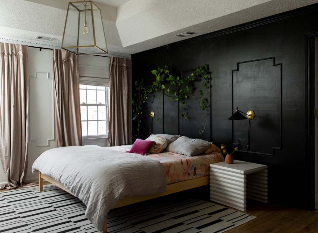
Scandinavian style is known for its natural, minimalist, and functional design, with cool tones and neutrals to create a natural and comfortable living environment.
- Primary Color: Use white or light gray to keep the space simple and bright.
- Secondary Color: Choose light blue or soft green for a fresh, natural feel.
- Accent Color: Select deep blue or dark green accents, such as HAY’s deep blue cushions, to add depth and a touch of Scandinavian charm.
c. Retro Style
Retro style emphasizes rich colors and textures, suitable for those who appreciate a unique and personalized home.
- Primary Color: Use deep brown or olive green to create a rich, retro atmosphere.
- Secondary Color: Opt for burgundy or gold to complement the primary color.
- Accent Color: Use bright yellow or jewel-toned blue, such as Anthropologie’s jewel-toned décor, to add striking details.
2. Bedroom: A Haven of Tranquility
The bedroom is a place for relaxation and rest, so color matching should focus on creating a serene and comfortable environment to enhance sleep quality and relaxation.
a. Simple Modern Style
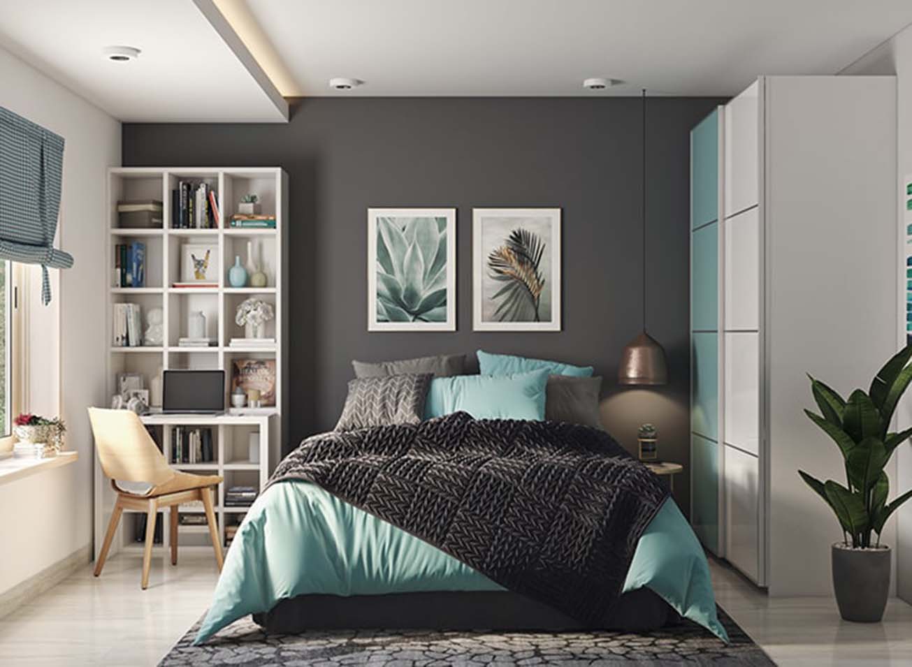
Simple modern style prioritizes tranquility and comfort, using cool tones and neutrals to create a relaxing retreat.
- Primary Color: Use light gray or white to keep the space simple and bright.
- Secondary Color: Choose light blue or soft green for a touch of nature.
- Accent Color: Opt for deep blue or dark purple, such as West Elm’s deep blue bedside lamps, to add a bit of sophistication.
b. French Romantic Style
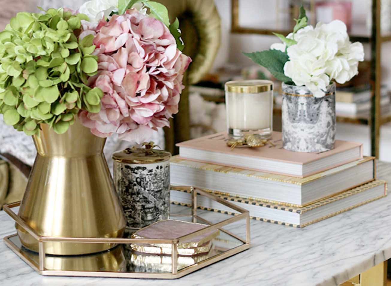
French romantic style is characterized by elegance and romance, with soft pinks and whites to create a warm and charming atmosphere.
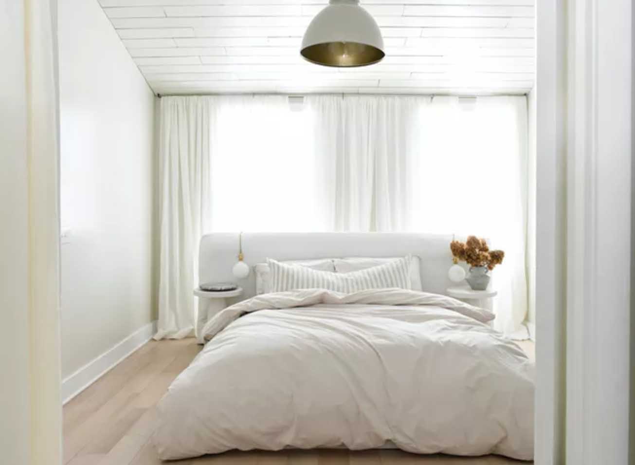
- Primary Color: Use white or ivory to create a bright, elegant environment.
- Secondary Color: Choose pink or light purple for a romantic touch.
- Accent Color: Opt for gold or silver accents, such as Anthropologie’s gold mirrors, to add a touch of luxury.
c. Japanese Minimalist Style
Japanese minimalist style focuses on natural and simple aesthetics, using neutral and natural colors to create a peaceful and comfortable environment.
- Primary Color: Use light wood tones or white for a natural and bright look.
- Secondary Color: Choose light gray or soft green for a tranquil feel.
- Accent Color: Opt for deep green or brown, such as Muji’s deep green décor, to add layers and natural elements.
3. Kitchen: A Culinary Paradise
The kitchen is the heart of food preparation,
and its color matching should create a functional yet inviting environment.
a. Modern Industrial Style
Modern industrial style uses bold contrasts and neutral tones to create a contemporary and functional kitchen space.
- Primary Color: Use gray or black for a sleek, modern look.
- Secondary Color: Opt for stainless steel or white to complement the primary color.
- Accent Color: Choose bright red or yellow, such as Crate & Barrel’s colorful kitchen accessories, to add a vibrant touch.
b. Classic Farmhouse Style
Classic farmhouse style is warm and inviting, with earthy tones and rustic textures creating a cozy kitchen environment.
- Primary Color: Use cream or soft beige to create a warm base.
- Secondary Color: Choose olive green or navy blue for a classic touch.
- Accent Color: Opt for warm brown or rust, such as Pottery Barn’s rustic décor, to add depth and charm.
c. Coastal Style
Coastal style uses light and airy colors to evoke a relaxed, beach-inspired atmosphere in the kitchen.
- Primary Color: Use white or light blue to create a breezy, open feel.
- Secondary Color: Choose sandy beige or soft aqua for a coastal touch.
- Accent Color: Opt for navy blue or coral, such as Wayfair’s coastal-themed accessories, to add pops of color.
Color matching in home design is like painting a vibrant and dynamic canvas. By understanding the basic color elements, applying practical principles, and tailoring inspiration to different rooms, you can craft a space that reflects your personal style and enhances your living experience. Whether you prefer a minimalist modern look or a cozy farmhouse vibe, the right color choices will breathe life into your home and make it a stylish and comfortable haven.
